Form Toolbox: C08_Form
Editors can easily create and manage forms within the main area of the application. They can specify essential details and configure various form fields to capture the required data accurately.
Set up your individual customer form
The Form Toolbox is used to gather and manage data through customizable forms. This includes setting up the form's main details and adding various form fields to capture specific information.
This form is not connected to CRM. Therefore please have a look into the specific CRM-Form module.
Form Field Types and Layout options:
- Text Field ("one liner"): single-line text input for brief responses.
- Mail Address: field for capturing users' email addresses incl. validation.
- Select Single: dropdown menu for selecting one single option.
- Checkbox Group: allows users to select multiple options from a list.
- Text Area Field: large text box for detailed responses.
- Text Field Read Only ("one liner"): Non-editable single-line text input for displaying fixed information.
- Hidden Field: allows to deliver information to the recipient
- Layout: Organizes and structures the form fields.
These field types and layout options provide flexibility in form creation, ensuring that editors can tailor forms to meet specific data collection requirements. The types will be described in the following more in detail.
Creating a Form
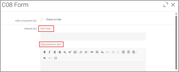
To create a form, navigate to the main area of a content page and add the component “C08 Form”. Here, you will be required to enter specific details:
- Form Title: define the title of the form for internal use.
- Data Protection Text: Text that informs users about how their data will be protected and used.
This field is mandatory and each form need to provide this information to get commitment from the sender to receive the personal data!
Example:
"Your personal data will be used solely for processing and responding to this request. For this reason, your data may, if necessary, be passed on to other companies in the Heraeus Group. Moreover, the data will not be published, passed on to third parties, or used for any other purpose. Details on our data handling policy can be found in our Privacy Policy (LINK)."
Mail Settings
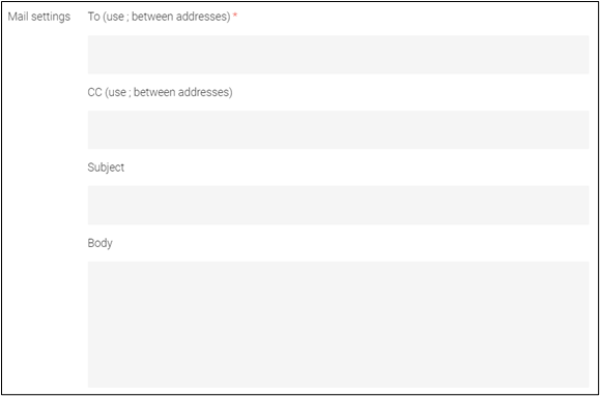
- define email addresses to where the form submission will be sent. Separate multiple addresses with a semicolon.
- You can also add a mail address in CC, if you like to ensure that further recipients receive the mail in addition as backup.
- The editor can further predefine a subject of the mail in order to help the recipient to identify the mail
Example: “Contact Form Hydrogen Website” - If it is helpful, some information could be given in the body text of the mail.
Once at least the mandatory fields are filled out, you can save the form and proceed with the next step.
Form success
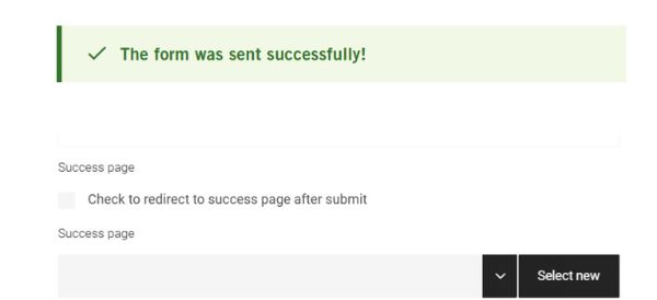
After sending the form the sender will see a technical hint on the form page: "The form was sent successfully". As an alternative the editor could create an individual success page, that is shown after sending the form. Therefor this individual page needs to be created first. Afterwards the checkbox to redirect a specific success page after sending within the form module needs to be activated and the respective page needs to be referenced.
With this individual success page the editor can provide further information to the sender of the form, for example providing related content to the topic.
Adding Form Fields
After creating the form, you can add various form fields as subcomponents. To do this, navigate to Form / New Component: Form fields. There are several types of form components available:
Select-Single
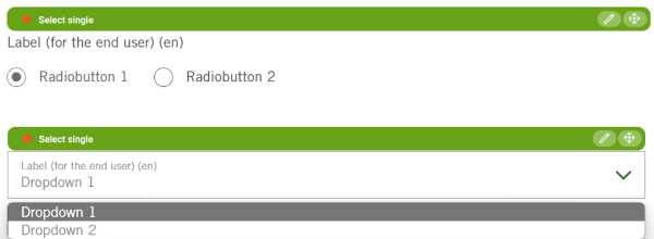
Feature: Allows users to select a single option from a dropdown list or radio buttions.
Usage: Ideal for selecting a single choice from a list of options, such as a country or salutation (e.g. Mr/Mrs/Ms/Div).
Options: Editors can choose between displaying the options as radio buttons or a dropdown menu. This should depend on the amount of values.
Recommendation:
if you just offer 2-3 options, radio buttons are quite nice; if you offer more then 3 options you should select the dropdown.
Checkbox Group
Feature: allows users to select multiple options from a list. As an editor you can define this list of values.
Usage: used to ask for e.g. multiple required documents or multiple choice questions

Mail Address
Feature: Field for users to enter their email address.
Usage: Used to get the email contact information to answer the request. This field is also validated automatically, means the system checks if this is a real mail address.
To support the expectation, that a real mail address is needed, editors can define a "Prefill Mail", which displays the required format.

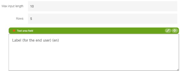
Text Area Field
Feature: Provides a larger text box for users to enter detailed information or comments.
Usage: Suitable for individual responses, feedback or detailed descriptions.
Recommendation:
This field size should be restricted to 100-300 characters by the editor depending on what kind of information is required. You can specify the maximum input length (the maximum number of characters allowed) and the amount of rows that is steering the height of the text area in lines.
Text Field ("one liner")
Feature: A single-line text input field.
Usage: Used for short text inputs such as name, company, street.

Text Field Read Only ("one liner")
Feature: A non-editable single-line text field that is read-only.
Usage: Used for displaying user information within the form, e.g. for some additional explanation.

Hidden Field
Feature: allows to deliver information to the recipient in the background.
Usage: deliver further context information to the recipient.

Example: How a form can look like
In the following there is an example for a form created with the C08_Form module in magnolia.
